

When it comes to choosing the perfect white paint, few colors have stood the test of time like Sherwin-Williams Alabaster (SW 7008). Loved by interior designers, homeowners, and architects alike, this soft white shade has a magical ability to make spaces feel warm, inviting, and timeless. But what makes Sherwin Alabaster so special? Let’s dive into the charm and versatility of this classic hue.
Understanding the Beauty of Sherwin Alabaster
Sherwin Alabaster is more than just “white.” It’s a creamy, balanced white with subtle undertones that make it feel cozy without turning yellow. It sits beautifully between warm and cool, offering the best of both worlds. It’s the kind of white that feels like sunlight streaming through sheer curtains a soft glow that brings peace and comfort.
The Origin and Popularity of Sherwin Alabaster
Introduced by Sherwin-Williams, one of the most trusted names in paint, Alabaster quickly became a favorite for its adaptability. In 2016, it was even named Sherwin-Williams’ Color of the Year, praised for its “quiet and understated beauty.” Since then, it has continued to top color charts as a go-to white for both modern and traditional homes.
Why Choose Sherwin Alabaster for Your Home
If you’re looking for a shade that works everywhere, Alabaster is your answer. It’s versatile, timeless, and effortlessly elegant. Whether you’re painting your entire home or just an accent wall, Alabaster complements every design style from farmhouse chic to urban modern. Its warmth brings life to spaces without overwhelming them.
Sherwin Alabaster Undertones Explained
One of the secrets to Alabaster’s appeal is its balanced undertones. It leans slightly warm with hints of soft beige and cream, yet it never feels too yellow. In north-facing rooms, it may appear a bit cooler, while in sunny spaces, it glows with a gentle warmth. That flexibility makes it an easy choice for any lighting condition.
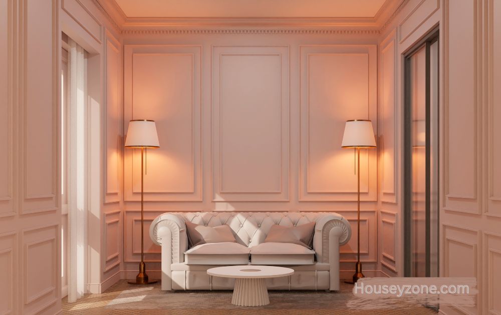
Best Rooms to Use Sherwin Alabaster
Living Rooms
Alabaster creates a calm and welcoming atmosphere, perfect for spaces where you relax and gather.
Kitchens
It pairs beautifully with white marble, natural wood, or black accents making kitchens look fresh and timeless.
Bedrooms
For bedrooms, Alabaster offers a peaceful retreat-like feel, pairing wonderfully with soft linens and natural textures.
Bathrooms
Its clean yet warm tone adds brightness to bathrooms without feeling clinical.
Exteriors
Sherwin Alabaster also shines outdoors, giving homes a soft, classic look that complements brick, stone, or siding.
Pairing Sherwin Alabaster with Other Colors
Complementary Colors
Soft blues, greens, and grays enhance Alabaster’s warmth beautifully.
Contrasting Colors
Pair with navy, charcoal, or deep forest green for striking contrasts that still feel sophisticated.
Neutral Combinations
Combine with taupe, beige, or greige for a serene, cohesive palette.
Sherwin Alabaster in Different Lighting Conditions
Lighting can dramatically affect how Alabaster appears. In natural daylight, it reads as a true, creamy white. Under warm artificial lighting, it takes on a slightly buttery tone. In cool LED light, it appears crisp but never stark. Always test a sample in your room before painting to see how it behaves throughout the day.
Sherwin Alabaster vs Similar Colors
Alabaster vs White Dove (Benjamin Moore)
White Dove is a bit cooler, while Alabaster leans warmer and creamier.
Alabaster vs Greek Villa
Greek Villa is lighter and more neutral, whereas Alabaster carries a touch more warmth.
Alabaster vs Simply White
Simply White feels brighter and more reflective, while Alabaster offers a softer, cozier feel.
The Perfect Trim and Ceiling Colors
For trim, use Alabaster itself in a semi-gloss finish for a seamless, modern look. Alternatively, pair it with Pure White (SW 7005) for subtle contrast. On ceilings, a flat version of Alabaster keeps the space cohesive and airy.
Sherwin Alabaster in Modern Interiors
In minimalist and modern homes, Alabaster provides a neutral backdrop that highlights furniture and artwork. It brings a touch of warmth that prevents sterile or cold interiors a perfect balance between crisp and comforting.
Using Sherwin Alabaster in Traditional Homes
In traditional spaces, Alabaster’s soft tone complements crown moldings, wainscoting, and vintage furnishings. It enhances architectural details without stealing attention, giving your home an effortlessly timeless elegance.
Tips for Painting with Sherwin Alabaster
- Always sample first on your wall.
- Choose satin or eggshell finishes for living spaces and semi-gloss for trim or cabinetry.
- Pair it with warm woods or matte black accents for a designer touch.
Maintenance and Longevity
Alabaster is easy to maintain. Use mild soap and a damp cloth for cleaning. Its creamy tone hides minor scuffs better than pure white, ensuring your walls look fresh for years.
Conclusion
Sherwin Alabaster isn’t just paint it’s a feeling. A soft, serene, and adaptable shade that brings warmth and sophistication to any room. Whether you’re creating a cozy cottage, a modern loft, or a classic farmhouse, Sherwin Alabaster is a timeless choice that never disappoints.
FAQs sherwin alabaster
1. Is Sherwin Alabaster too white?
No, it’s a warm white that feels soft and balanced, not stark or sterile.
2. Does Sherwin Alabaster work with gray?
Absolutely! It pairs beautifully with both warm and cool grays for a modern, layered look.
3. What’s the best trim color for Alabaster walls?
Try Alabaster in a glossier finish or use Sherwin-Williams Pure White for a crisp trim contrast.
4. Can Sherwin Alabaster be used on exteriors?
Yes! It looks stunning on exteriors, offering a timeless, elegant finish that resists fading.
5. Is Alabaster warm or cool?
Alabaster is a warm white with subtle beige undertones, making it feel cozy and inviting.